
Amato cafe & spritz - digital menu
- Customer
- Amato cafe & spritz
- Location
- Pompeii
- Date
- January 2026
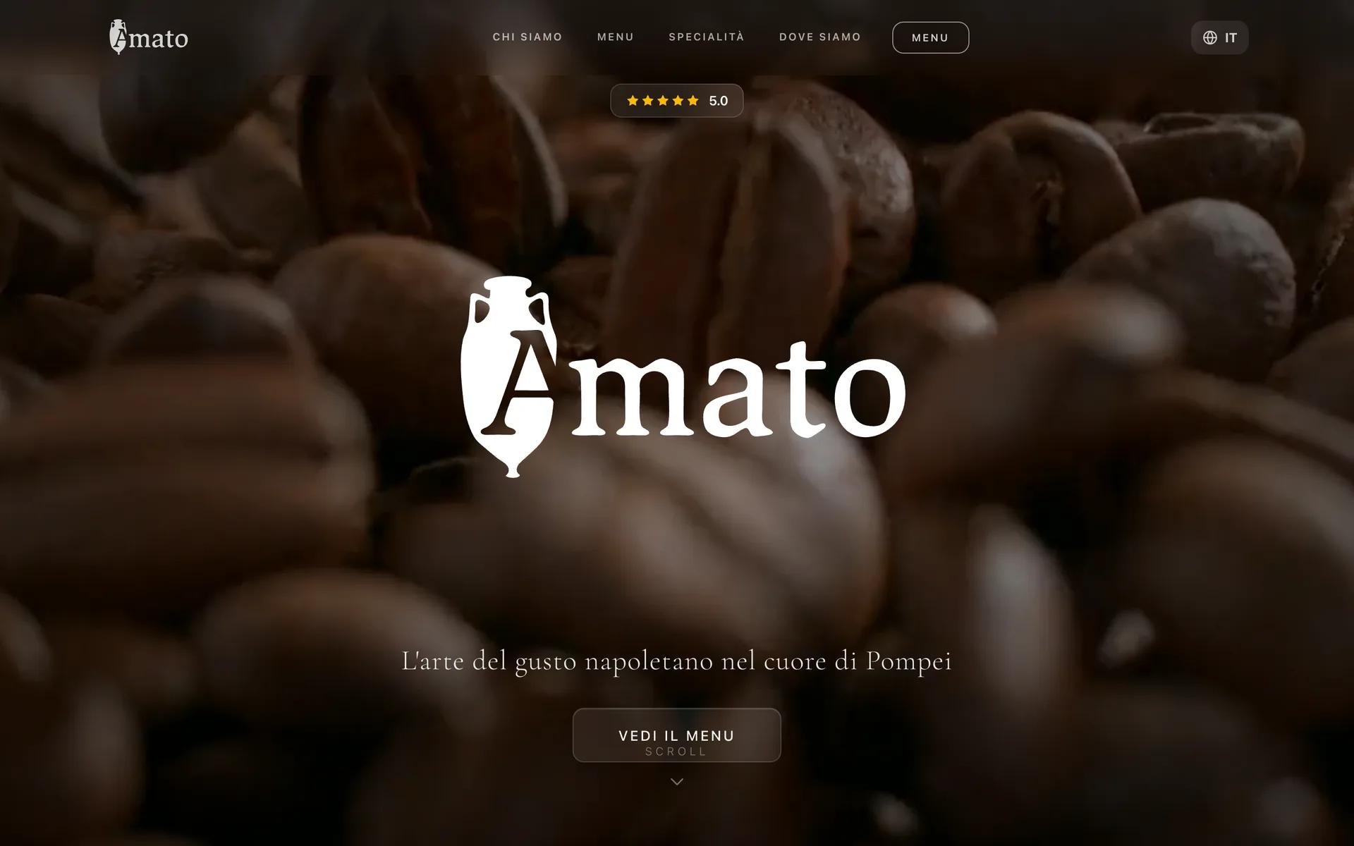
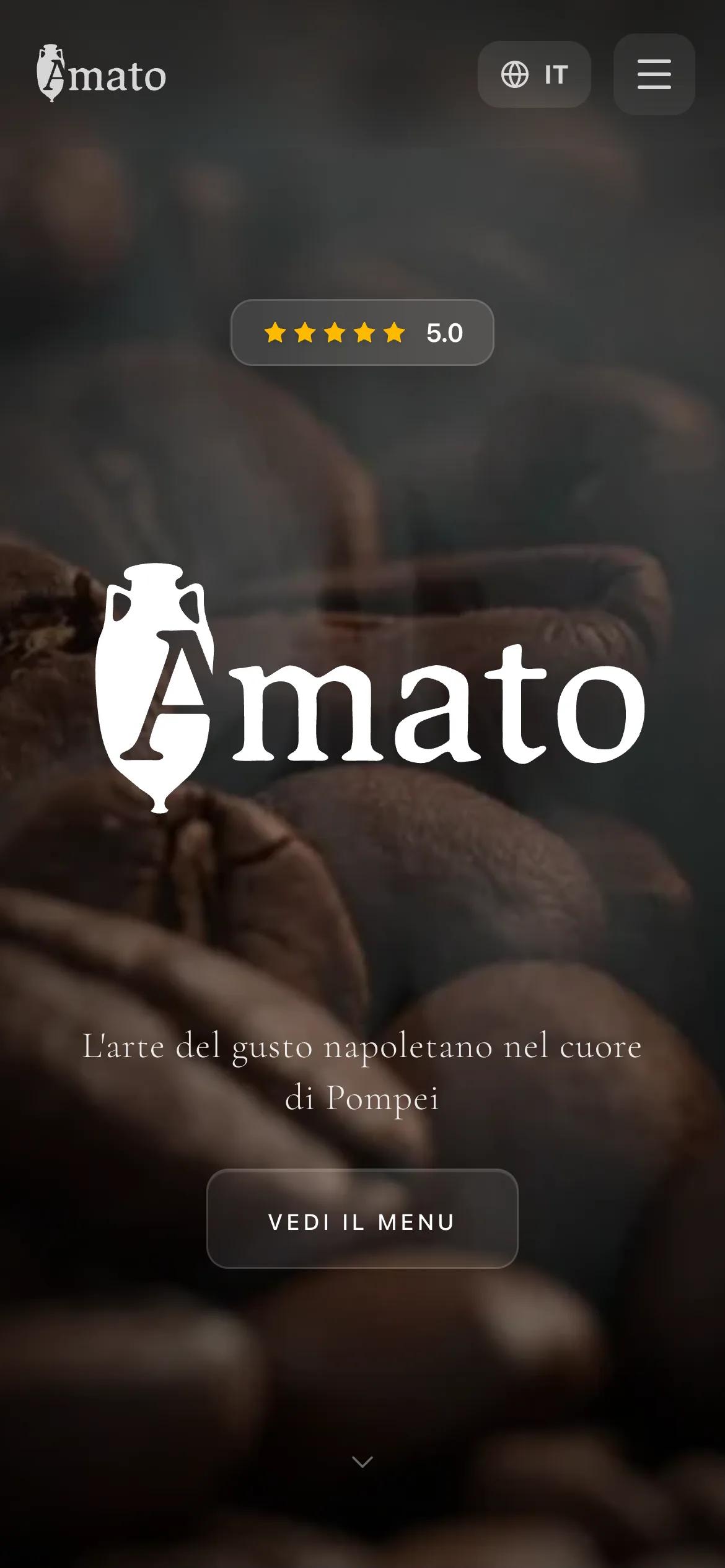
For Amato Cafè & Spritz we created a complete identity from the logo to the palette up to the website with digital menu.
For Amato Cafè & Spritz we worked on a new identity that described Pompeii through the rituals of a neighborhood bar: from the morning coffee to the spritz at sunset. The goal was to make the restaurant recognizable and coherent across all touchpoints, designing an identity and website with a digital menu for a fluid online and offline experience.
The heart of the creative challenge was the recovery of an archetypal symbol: theRoman amphora. Historically used to transport wine and oil, the amphora represents quality conservation and cultural exchange in the Mediterranean.
The Logo Concept
We integrated the silhouette of the amphora directly into the structure of the letter A, initial of the brand. This fusion creates an indissoluble bond between the name and the symbol:
- Typography: The use of a character serif (with serifs) recalls classical epigraphs, conferring authority and style.
- Visual Summary: The "A" set in the amphora becomes a monogram recognizable even in small dimensions (social media, icons, merchandising).
- Meaning: The design immediately communicates the values of conviviality, hospitality and a deep connection with the Campania region.

Landing


Digital menu


Google review
“I found an excellent result, I no longer have problems with my place, serious people.... Alessandro was exceptional.”
Alessandro Vassallo · Amato cafe & spritz
Read on GoogleThe team on this project



Projects similar

Tell us your idea: we will respond within 24 hours, online or in person.
Let's talk about it